Grid Layout - Part 1: The Basics
Back on the 7th of April 2011 the W3C creating a working draft for Grid Layout. The draft has the following opening line:
Grid Layout contains features targeted at web application authors. The Grid can be used to achieve many different layouts. It excels at dividing up space for major regions of an application, or defining the relationship in terms of size, position, and layer between parts of a control built from HTML primitives.
Fast forward almost six years and we’re not far away from this being available in all modern browsers. You can use it now in the relevant development browsers and I’ve spent the past few weeks playing around and building an array of different layouts.
The most simple was of using grid layout now is by using @supports within your CSS. Remember though, you will need to provide a fall-back before using this for browsers that don’t support grid.
@supports (display: grid) {
  .wrapper {
    /* your rules here */
  }
}
Declaring a grid
Declaring a grid is pretty simple. There’s no new property to learn, you simply just use the display property and give it a value of grid.
.wrapper {
  display: grid;
}
Rows and Columns
If you ever had the pleasure of building for the web when we used tables then grid is going to feel quite similar. If you’ve used a CSS framework over the past few years to build your pages then the terms row and column shouldn’t be anything new to you.
Rows
Using the grid layout you don’t need to do anything special. You don’t need to specify a row width, you don’t need to add a div in your content called row. You simply give your selector a property of grid-template-rows and specify the track size of your rows.
.wrapper {
  grid-template-rows: 40px 400px 40px;
}
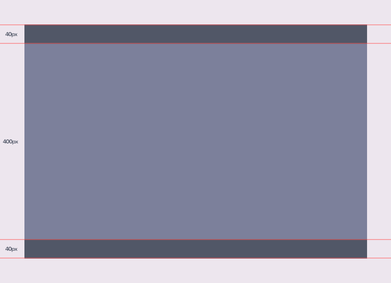
Above we’re simply saying that our page should have three rows. The first and last should be 40px in height, the second where the main content of the site will sit, will be 400px.
Columns
We’ve specified our rows above, we now need to specify how many columns will sit within these rows and their track sizes. This is similar to what we have done above for our rows, but we’re going to use grid-template-columns instead.
.wrapper {
  grid-template-columns: 150px 1fr 150px;
}
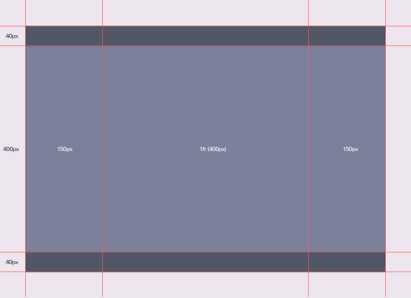
Here, I’m simply saying that the first and last column should be 150px wide and the centre column which will hold the main content should fill the remaining space using the fr unit. The fr unit, means free space.
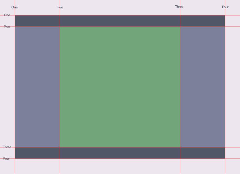
Grid Lines
On the image below you will notice the red lines with text over the top of them. These are what we call grid lines and they can either be horizontal or vertical. When you’re specifying your row and column start and end values, you will be referring to these lines.
Grid Tracks
Grid tracks are the space between two grid lines. Once again these can be horizontal or vertical. The 40px area in the image below is what would be referred to as the track between grid lines three and four.
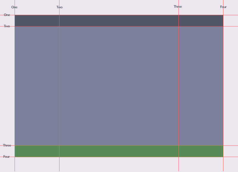
Grid Cell
A grid cell is the space between two adjacent rows and column grid lines. In the image below the cell sits between row lines two and three and column lines two and three.